So, What’s in a Color?
When looking at the most successful brands out there, one can’t help but notice a visual link that they all seem to share — bold, recognizable colors. You can’t say the names of brands like ‘Coca-Cola’, ‘Starbucks’, ‘Cadbury’s’, ‘Facebook’ or ‘Home Depot’ without instantly evoking images of red, green, purple, blue and orange, respectively, shimmering loudly in your mind.
And that’s not by accident.
Brands spend countless hours, power through multiple brainstorming sessions, and pore over endless iterations trying to create a visual language that builds brand awareness and loyalty directly into the logo, website or other marketing elements. These colors evoke a host of subconscious feelings in every viewer, and when going all-in on these colors — these brands are able to successfully create strong associations that last.
All the proof you need to see this phenomenon in action, is to try and give your significant other a Valentine’s Day gift wrapped in ‘Tiffany Blue’…that doesn’t happen to contain a Tiffany & Co. product inside. Go ahead, watch what happens.
So if you’re in the wonderful and challenging process of creating your brand from the ground up, or even rethinking your entire branding approach, we’ve created a handy guide to the psychology of color in marketing, to help you find hues that heighten, tones that tempt, and shades that really shake things up. Grab your palette and read on!
Reds
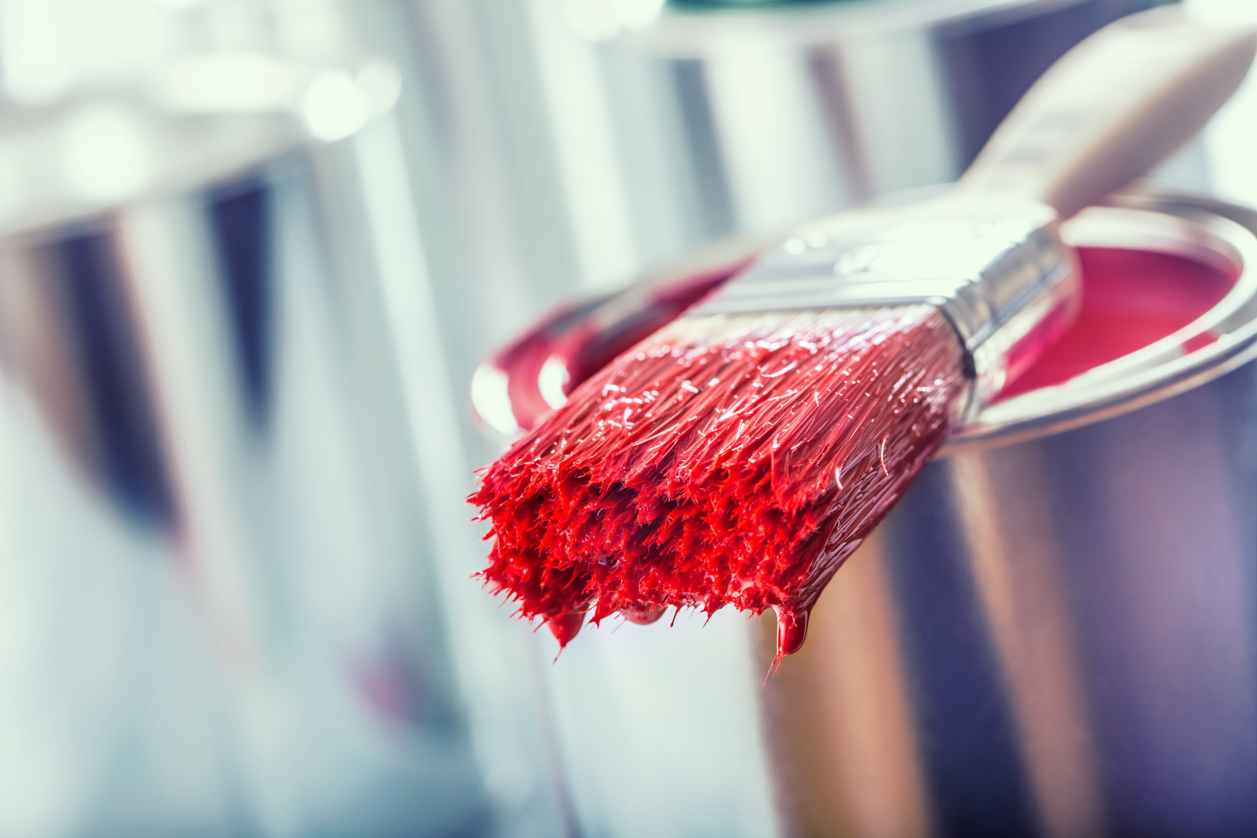
Long utilized by Chinese restaurants for its appetite-activating effects, reds evoke passion and excitement, and are great for creating a sense of urgency. That’s why, whenever you see advertising for a big sale, chances are it’s going to be draped in red. This is a great color for brands looking to express heightened emotion, high-energy or movement.
Blues
Not to get too gender-stereotypical over here, men by and large prefer blues in their marketing. Along with creating a sense of peace and tranquility (a la water), it also symbolizes security and maturity. Products or services that depend primarily on expressing trust should think about using blues.
Greens
Greens are all about evoking two aspects of nature — power and tranquility. Brands looking to express healthy lifestyles, natural products or environmental causes typically use greens in their marketing. Two perfect examples of green marketing involve John Deere, which used it successfully to link their brand with agriculture and farming; and Starbucks, which used it to promote a sense of calm and relaxation in their cafes — furthering their ‘third-place’ mission.
Oranges & Yellows
Let’s get loud. Orange and yellow hues are the go-to colors to express cheerful optimism, positivity and creativity. If your brand is all about creating that can-do spirit — go ahead and paint your brand with abandon. But be careful, certain shades of orange may be linked with caution, which is probably the opposite effect of what you’re going for, unless you sell wet-floors signs or emergency gear.
Purples
Wisdom, royalty and class are all hallmarks of the color purple. Used frequently in beauty and skincare, this shade is all about evoking a quiet sense of security and confidence. A ‘we don’t need to prove ourselves, we’re that good’ kind of approach.
Blacks
The first of the anti-colors, black is associated with authority, power, strength and stability. Despite what you may think, black does not have a debbie-downer kind of effect on your brand. Too much black can be a little overwhelming, but mega-brands like NIKE and Chanel have used it gorgeously and effectively.
Grays
Grays can be a bit of a mixed bag. They tend to be associated with practicality and solidarity on one end of the spectrum, and old age and retirement on the other. Apple bucked both of these trends with their stunning use during their successful rebrand. Their subtle gray and white combo elicited simplicity, which supported their design-first approach.
Whites
The go-to color for all-things minimalistic, whites offer an unaltered clean slate for brands looking to express little, and have their viewers use their imaginations to fill in the rest. The smartest example of this is in the Google logo — which sets a rainbow of primary colors atop a clean, white background. This effectively illustrates the ‘anything/everything’ philosophy of the tech giant.
Whatever color or combination of colors you decide to go with, make sure to double down on it in all of your marketing efforts. And we mean all of them — at Ameba Marketing, we take great pains (remember all those hours, brainstorming sessions and iterations?) to find a brand’s visual identity, and integrate it into their logo, website, landing pages, ads, emails, even product packaging. This is the best way to set a firm foundation between your brand and your customer’s awareness and association with it. We hope our guide to color psychology in marketing serves you well. Now get out there and start painting.


